Butter yellow is the rare color that reads cheerful without shouting. It holds up in daylight, flatters almost every skin tone in photographs, and leaves room to push in a direction most palette guides never mention. These six pairings all start from the same soft yellow base and then take it somewhere unexpected — inky, cool, metallic, or earthy — using a few deliberate choices per table. Think of them as six moods built on one color rather than six separate themes. Choose one and let it run through flowers, paper, and glassware before you add anything else.
1. Tone-on-Tone Ivory
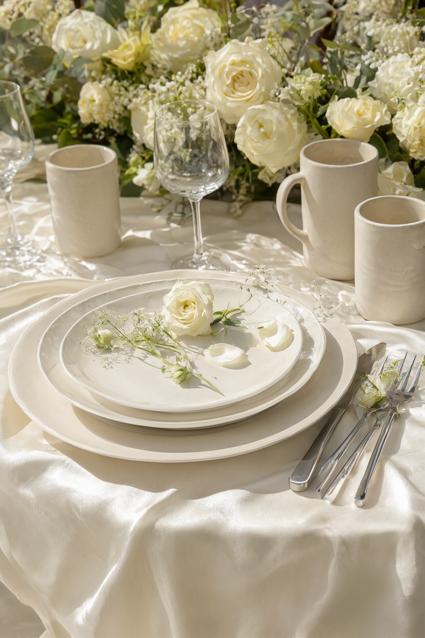
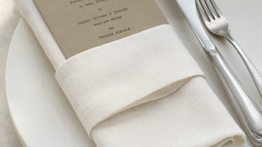
Butter yellow and warm ivory work best when you stop adding colors and start adding texture. Choose a silk faille cloth in butter, then keep the plates, menus, and glassware in matte ivory so the table reads soft rather than washed out. Bring in cream garden roses with slightly opened petals and a few matte ceramic cups to break up the light. Set the roses in low, wide vessels so the blooms sit near the rim instead of towering over the plates. Use warm-white bulbs around 2700K for evening receptions, because a cool bulb will turn the butter green in photographs. If you want one more layer, add a linen napkin with a visible weave — the change in surface does more than a second hue ever would.
2. Charcoal Ink
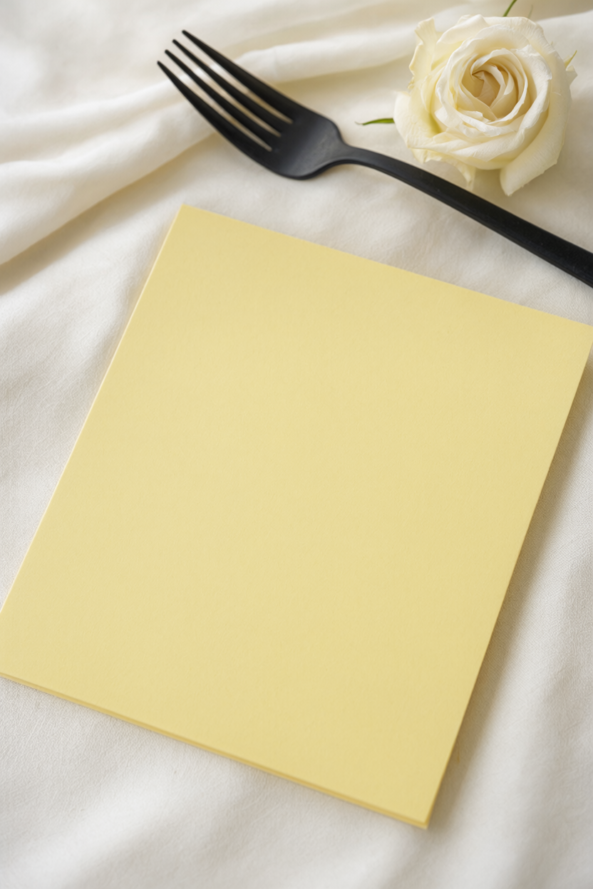
Charcoal gives butter yellow its graphic edge, but only in small doses. Print menus and table numbers in a thin charcoal serif, then repeat that tone in matte black flatware and one dark ceramic bowl per table. Keep the flowers cream and yellow so the scheme stays warm instead of turning severe, and leave the cloth butter so the ink has something soft to sit against. Skip black linens entirely, since they flatten the contrast you are trying to build. Photograph this table in flat daylight so the charcoal stays black rather than picking up blue from the sky.
3. Slate Blue Contrast
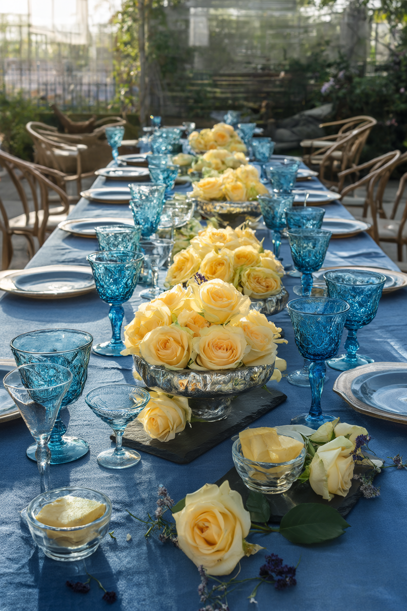
Slate blue cools butter yellow without the crispness of navy. Use the blue on the tablecloth or on glass goblets, not both at full strength, and bring the yellow back through low bowls of butter yellow roses so the two colors meet at eye level. Leave white out of the mix, because cream and blue can read nautical while slate and butter stay soft. Late-afternoon light flatters this pairing more than bright midday sun, so plan a late reception if the schedule allows it. A slate blue ribbon wrapped around the bouquet carries the idea through to the ceremony, and clear glass candle holders keep the light warm rather than tinted.
4. Chrome Accent
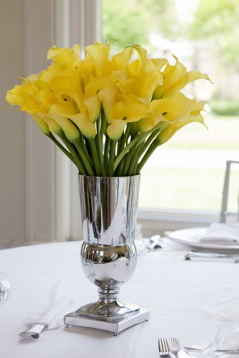
Chrome works as a neutral here rather than as a sparkle. Start with a chrome pedestal vase, silver flatware, and one mirrored tray for cards or drinks, then keep the cloth white and the flowers butter yellow so the metal reads modern instead of retro. Limit chrome to two or three surfaces, and repeat it in small details like napkin rings or a cake stand. Polished chrome reflects whatever is in front of it, so place the vase where it will bounce window light rather than a dark wall. Wipe fingerprints before the guest photos, because the metal shows every one.
5. Blush Gradient
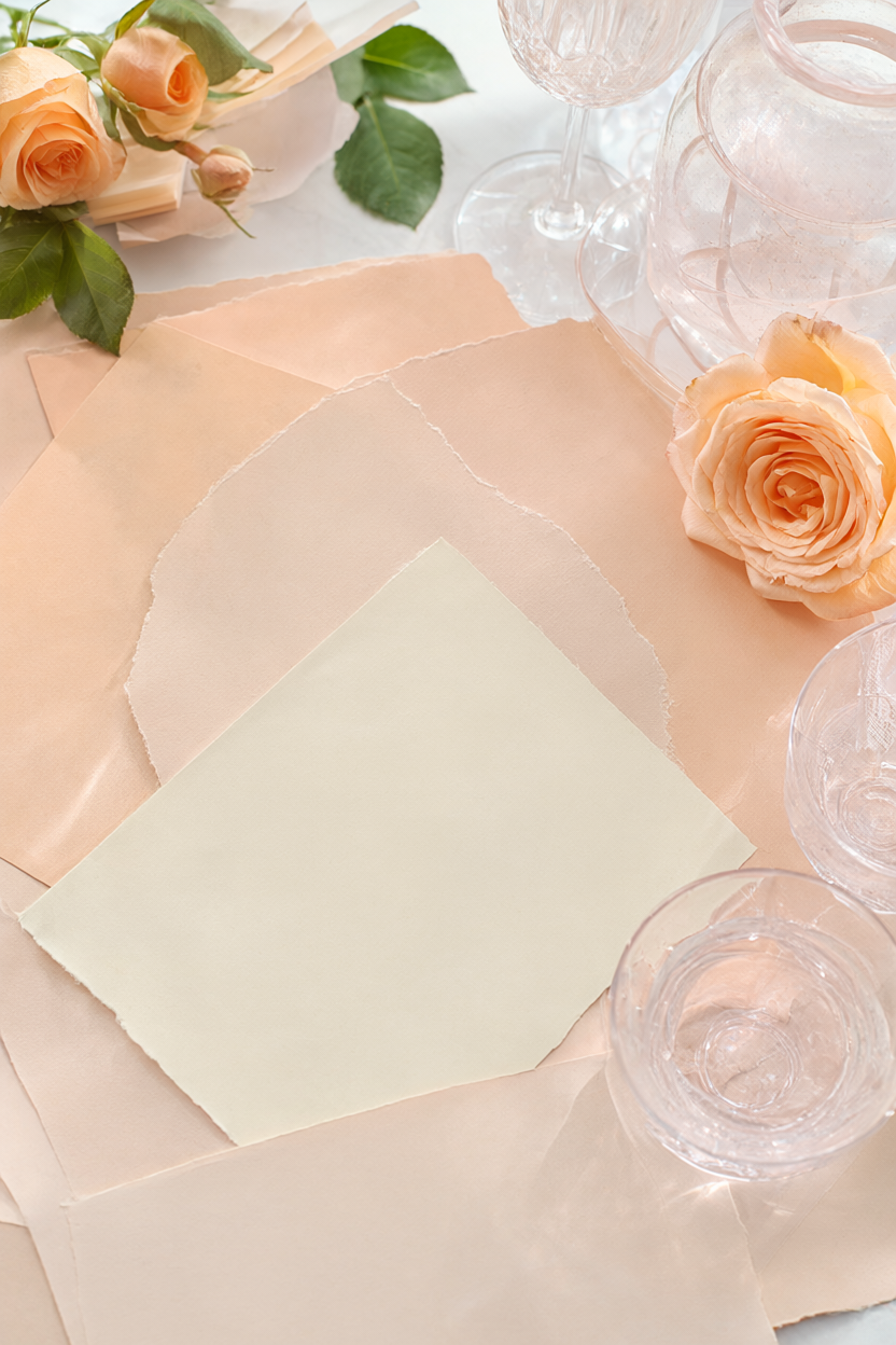
Instead of a contrast, build a gentle gradient from butter yellow into blush and peach. Put the deepest peach in the flowers, blush in the glassware, and butter on the paper and cloth so the shift looks intentional rather than accidental. Skip bright pink entirely, because it breaks the run of tints and pulls the eye away from the yellow. Choose roses in three stages of openness so the color moves gradually across the table. Place a butter menu at each cover and let the peach and blush stay near the center of the table. This is the most forgiving of the six pairings for a daytime wedding, since the tints read clearly in flat light and stay soft in photographs.
6. Clay & Butter
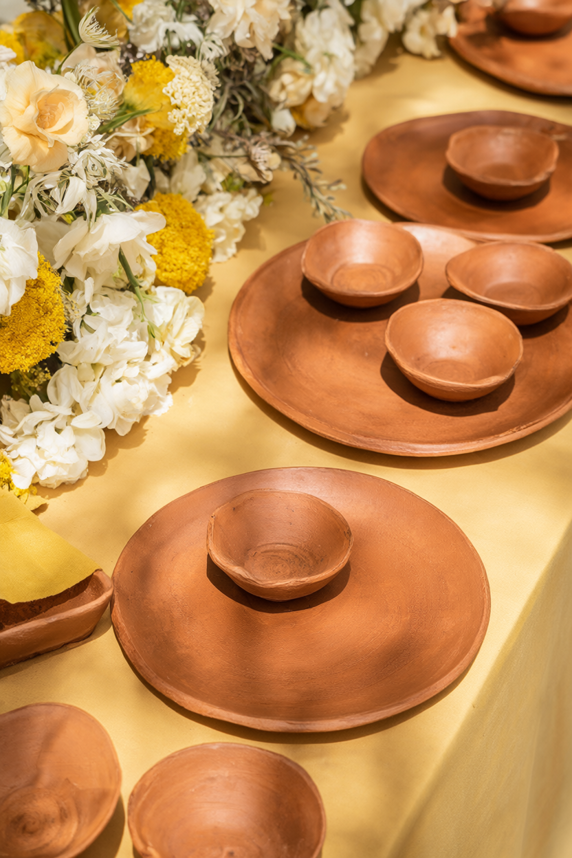
Butter yellow with matte terracotta gives you an earthy, modern table without tipping into rustic. Use clay chargers and small unglazed bowls, a butter yellow cloth, and cream and yellow blooms with little or no greenery. Keep every clay piece unglazed, because a glaze adds shine and pushes the look toward the wrong kind of rustic. Set the plates slightly off-center so the clay rims stay visible against the cloth. Terracotta chips easily, so ask the rental company for a few extras and stack the chargers only two deep in transit.
None of these pairings needs a large budget, because each one works by limiting the colors and choosing surfaces on purpose. Start with the butter yellow, pick a single partner, and let texture carry the rest of the table. Take one phone photo of the finished table before the room fills, and check that the buttery tone still reads true on screen. Whichever direction you take, the palette will stay unmistakably butter yellow in every photograph.