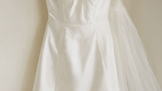
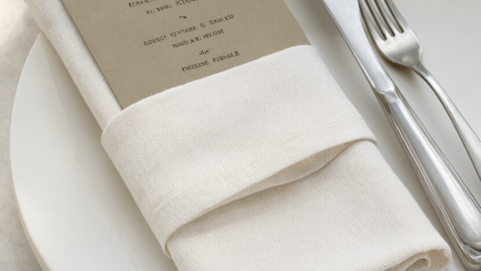
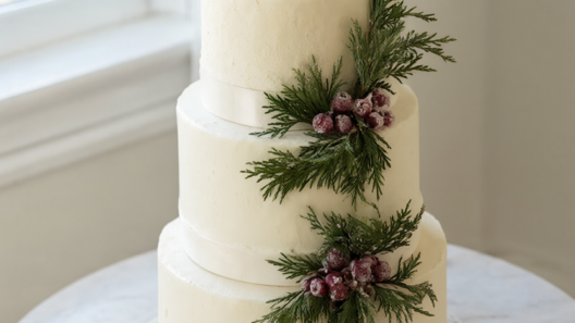
What makes a wedding palette look old money? It is rarely expense; it is restraint. The most collected estate weddings use one or two colors, plenty of texture, and nothing that competes for attention. The six old money wedding colors below are built on that idea: quiet, tonal combinations that let a stone manor, a courtyard or a garden do most of the talking. Each starts with a single grounding note, then surrounds it with the palest versions of itself — ivory, ecru, oatmeal, cream. Start with the palette that suits your venue rather than the one you saw most recently online, and repeat it across linen, china, flowers and stationery so the day feels decided rather than assembled. There is no seasonal decoration in any of these schemes, only color that will still look right in photographs years from now.
1. Estate Green and Ivory
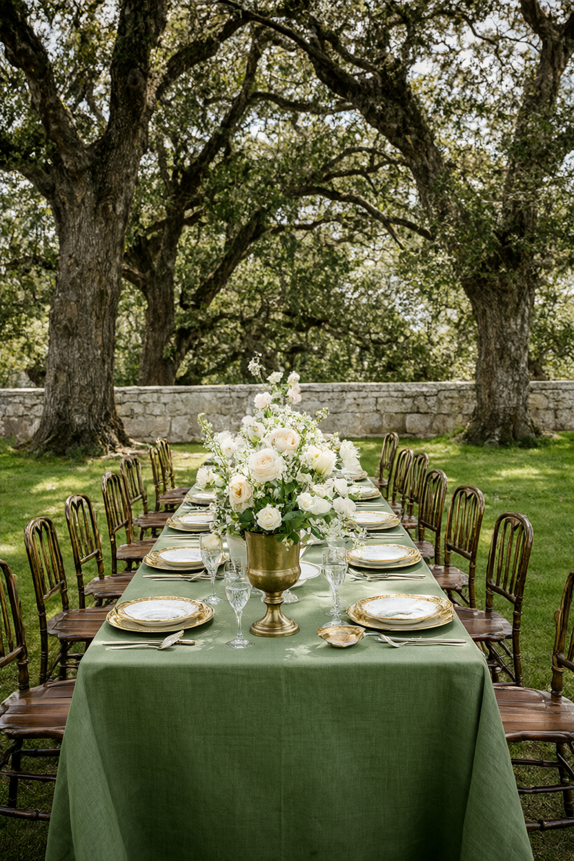
Deep forest green is the one saturated note, and it works best when it is used once and used generously: table linen, and nothing else in the same weight of color. Keep china, napkins and flowers in shades of ivory, then warm the green with antique brass urns and gold-rimmed plates. Carry the palette to every seat with matching green menus and place cards, printed in a small serif on uncoated card. Choose a single green rather than layering several, and let texture — linen weave, tarnished brass, soft petals — do the rest of the work. If you want candlelight, use ivory tapers in low brass holders so the flame stays part of the scheme.
2. Yacht Club Navy and Cream
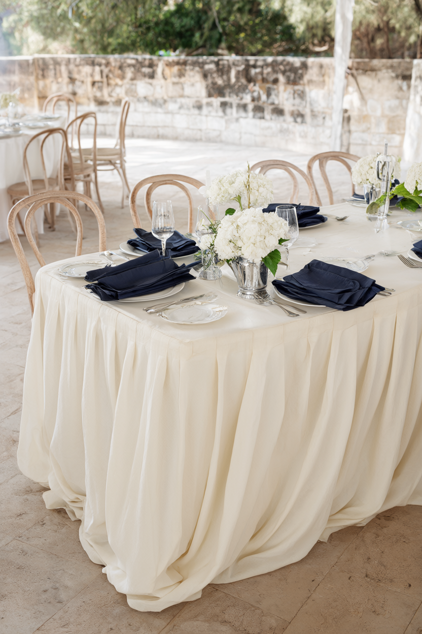
Treat navy as a trim rather than a theme. A cream cloth, cream chair covers and cream china do the background work, while navy appears only in folded napkins and menu covers, with brass flatware and white hydrangeas to keep things formal. Two or three navy details are enough; any more and the room tips from clubby to nautical. Repeat cream everywhere the eye lands, so the dark accent stays crisp instead of heavy, and keep the flower arrangements low so the navy at each place setting remains visible across the table. Silver beakers for the hydrangeas add a second cool note without introducing a new color.
3. Camel and Ecru
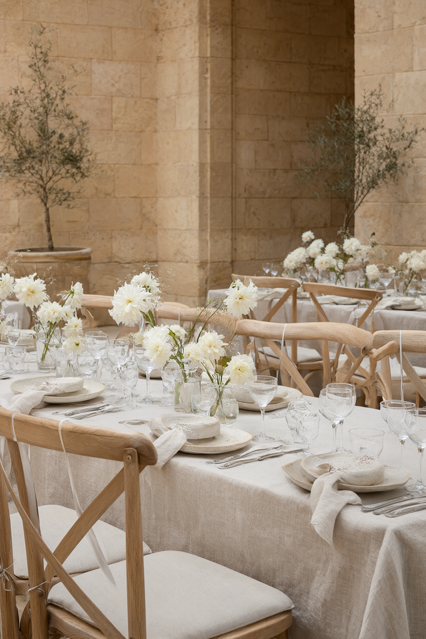
Build this one tonally: camel, ecru and warm stone, with texture doing what contrast would normally do. Camel linen napkins sit beside ecru stoneware, white dahlias and warm limestone, and one darker wood tone — a chair, a tray, a sign — gives the scheme structure without adding a new color. It photographs softly, which makes it a forgiving choice for a daytime estate reception where the light keeps changing. Resist adding a metallic, because the warmth is already there in the stone and the linen, and ask for matte ceramics rather than glazed ones if you want the tone to stay quiet.
4. Dusty Blue and Oatmeal
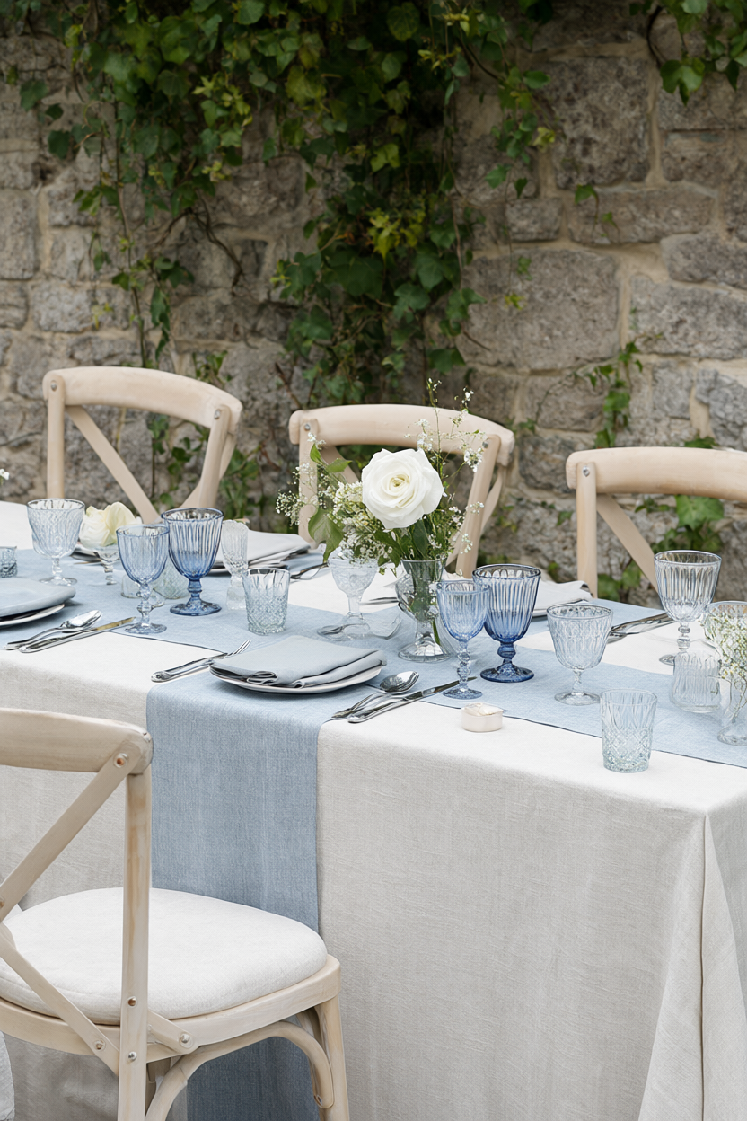
Pair dusty blue with oatmeal linen and pale wood for a calm, heritage feel. Put the blue in glass goblets and a table runner, then keep every flower white and green so the scheme reads collected rather than themed. Oatmeal is the important part: it stops the blue from looking cold in daylight and gives the table a softness that white linen cannot. Add ivy or trailing foliage at the edge of the table for a garden-room feel, and keep stationery in the same oatmeal tone as the cloth so nothing floats away from the palette.
5. Butter Yellow and Sage
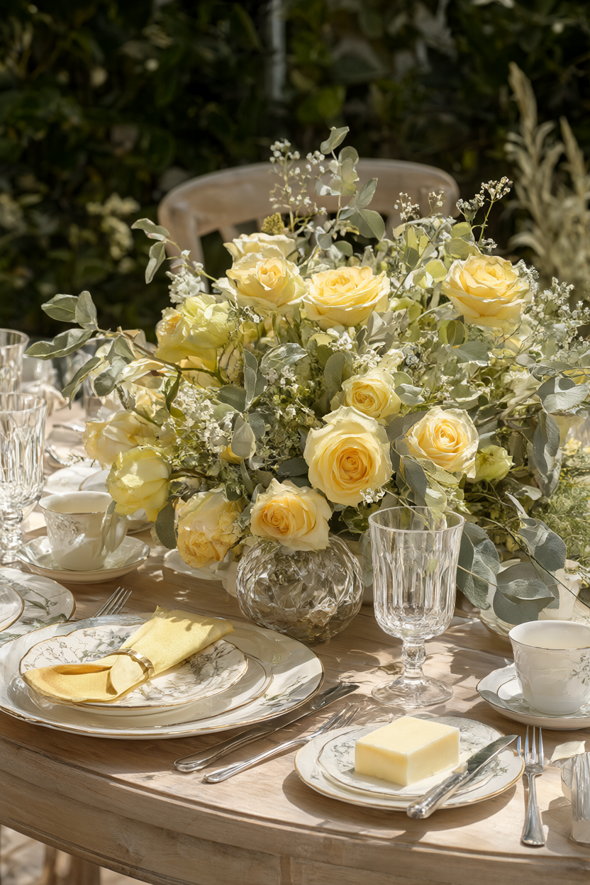
Choose a butter yellow that reads creamy rather than bright — closer to the inside of a rose than to a lemon — and use it for roses and napkins only. Sage foliage and cream china ground it, and pale wood plus natural linen finish the table without introducing a fourth color. Repeating the yellow in exactly two places keeps the palette elegant; a third will start to feel like a theme party. Filtered garden light flatters this combination more than any other on the list, so plan the table under a tree rather than in open sun, and keep the glassware clear rather than tinted.
6. Stone Grey and Antique Gold
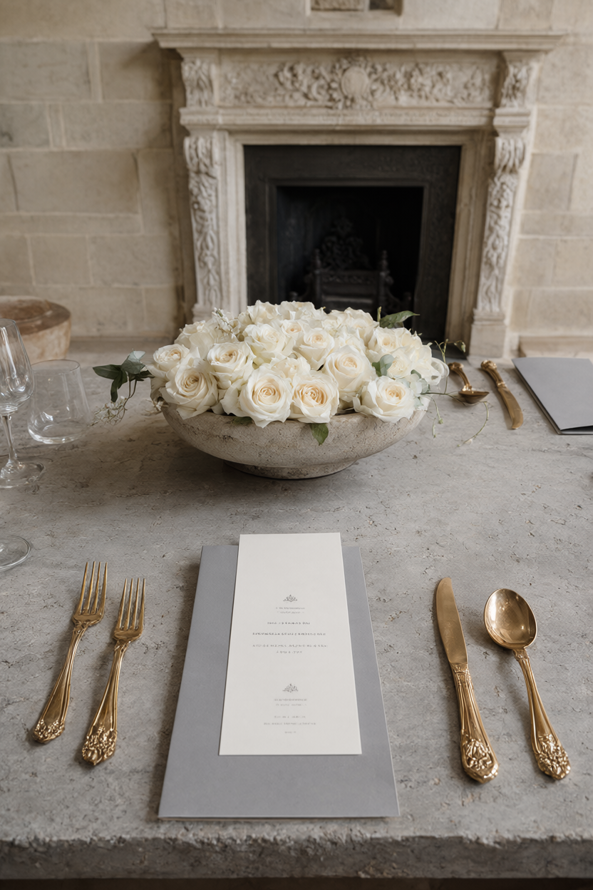
Anchor the table with stone-grey linen, then add antique gold flatware and cream roses for warmth. Keep the gold matte or antiqued rather than polished, because shine is what makes gold look new. Repeat grey in tailored menu cards, and keep the vessels low and simple — a stone bowl rather than a tall arrangement — so the architecture of the room stays visible. This is the most formal palette of the six and suits limestone rooms and evening receptions without a single seasonal decoration. If the room has a fireplace, use it as the backdrop and light the table only with candles.
Whichever of these old money wedding colors you choose, the result depends less on individual pieces than on repetition. Decide on two or three tones, use them consistently across linen, china, flowers, stationery and the smallest details, and let the venue supply everything else. Ask to see the linen sample in the actual room at the hour your reception begins, because stone, daylight and candlelight all change a quiet palette. Restraint, repeated carefully, is what makes these combinations look as though they have always belonged in the house — and it is the one thing no budget line can buy.